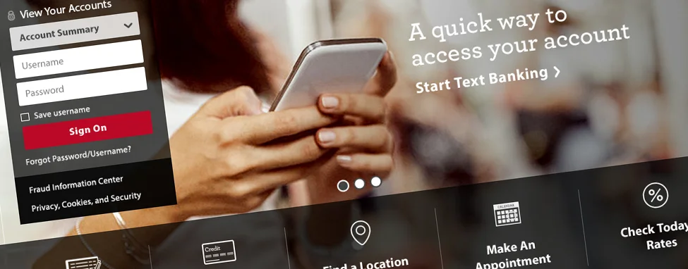
WellsFargo.com Homepage Redesign
Category: digital, website homepage, product design, ux/ui design, research, strategy
Role: project lead, art and experience director, customer testing, strategy and project prioritization
Project Summary: As project lead, art director and designer for Wells Fargo's Digital Experience team for five years, I managed and redesigned their main homepage that receives more than three million views each day from customers and prospects. When we began the project, the bank’s homepage had not been designed for four years. We entered this project by focusing on the needs of our customers, while keeping the company’s specific business goals and principles in mind. Throughout the makeover, my team and I iterated on more than nine design directions, gathered feedback from nearly 2,000 participants, and worked closely with eight different project teams. The final design has produced an increased marketing engagement by 153% and an improved page load time of 12%.
(Some material has been masked due to confidentiality.)

Material has been masked due to confidentiality.
Research
I began by learning as much as I could about the current page using comScore analysis to understand how it was performing, what customers were looking for and to see who was doing it better. I also conducted independent competitive analysis at an international scale.
Strategic Partnership
My close relationship with the digital marketing team allowed me to iterate on some early ideas and directives coming out of that group. In addition interviewing our customers, we also spoke with business partners to clearly identify their “must have” needs, creating a transparent and supportive relationship.
Design strategy
After identifying our customer and business needs, design and strategic objectives, and brand perspective, I evolved two earlier ideas into four distinct directions, which incorporated marketing angles and our custom customer personas.
Material has been masked due to confidentiality.
Material has been masked due to confidentiality.
Customer Testing
I leveraged every customer insights tool in our tool belt for this phase of the project. It started (and continued throughout the project) with internal “open houses” that included guided reviews, online surveys and comment cards. Our most illuminating test was a benchmarking study that we applied to four distinct design directions with approximately 1,800 participants. This study consisted of a series of questions, A/B selections and a visual heat map with verbatim feedback. As refinements continued, my team and I conducted a series of qualitative studies that helped us narrow in on specific choices.


Refinement
Armed with robust customer insights and facing a fast-approaching timeline, the next steps of consolidation, refinement, and buy-in became critical. I created and conducted a two-day workshop with our digital project partners to narrow down our direction based on the extensive customer feedback we had received. By realigning our preferences and staying focused on our objectives, I could quickly refine our design approach: consolidating four directions into two, then into one final direction.
Results
When the broader design phase was completed, I focused on fine-tuning all of the important details, including the final content and imagery, personalization, interactions, load time, official documentation, and QA. The end-result is a fresh homepage that proudly represents the modern-day brand, more efficiently provides customers with the information they’re looking for, and supports the growth of the business. The redesign has led to significant results: increased marketing engagement by 153% and an improved page load time of 12%
Want to see more?
Email me at akar123@gmail.com for more details.